Garamond is the name of a family of old-style serif typefaces. It is so well known that it just had to appear in my list of interesting fonts.
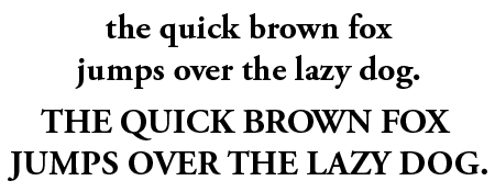
What does Garamond look like?


What do you use Garamond for?
Garamond typefaces offer elegance and readability, making them suitable for a wide range of applications. Since it is such a popular typeface, it may be interesting to also explore alternatives, such as Sabon, Granjon, Maiola, and Fabiol.
The history of Garamond
Claude Garamond (1480-1561) was a French publisher and type designer whose designs are the basis for many modern Garamond versions. Others are based on designs of Jean Jannon, a French printer who was also inspired by Garamond’s work. Over the years, their designs have inspired many foundries.
At the beginning of the 20th century ATF, Monotype and D. Stempel AG released new revisions. ITC Garamond was designed in 1975 by Tony Stan for the International Typeface Corporation. Robert Slimbach created the Adobe version in 1989.
Trivia
From 1983 to 2001 Apple used ITC Garamond as their corporate font. They actually had Bitstream condense it 80% because the existing ITC Garamond Condensed, at 64%, was considered too narrow. This version of Garamond is known as Apple Garamond. For years Bitstream sold it under the name of ITC Garamond Narrow.
Other sources of information
There is a rather elaborate Wikipedia page on Garamond. Also check this comparison of various revisions or if you’re more into rants, try this page.
I also love Garamond, and it was the first font I bought when I wanted more variety than the standard Adobe PostScript fonts.
Thanks for the comments on the Narrow version–food for thought on my next project.
Garamond Narrow must be my favorite font, and that for a couple of reasons:
1) Its elegance in curvature and style, in addition to the J gracefully descending below the baseline, to even more differentiate between itself and the upper case I (“eye”), and 2) It takes up less space than most other fonts, yet is readable, so when I develop a program, bulletin, or other printed medium, I am able to fit more information onto a page, without sacrificing clarity.