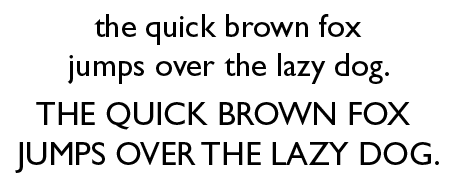
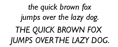
Gill Sans is a sans-serif typeface that has that efficient, clean-cut look that I like so much. Is it any surprise that it made it to my list of interesting fonts?
What does Gill Sans look like?


What do you use Gill Sans for?
Gill Sans lends itself for many types of jobs. It has clean lines but lacks the symmetry and geometry of Futura or Univers. This makes it a bit friendlier and more artistic looking. Many people seem to dislike the heavier weights of this font. Humanist 521, Granby, Bliss and Agenda are a few of the alternatives to Gill Sans.
The history of Gill Sans
The British sculptor, graphic artist and type designer Eric Gill created this font in a search to design the ultimate legible sans-serif text face. Edward Johnston’s sans serif lettering for the London Underground was his prime source of inspiration. Is it any surprise that Gill Sans was first used for railway signage at its release in 1928? The typeface was designed to function as a text face as well and has been a popular choice for decades. Originally released as a single weight, many variants were added over the years, extending the versatility of the typeface.
Trivia
Gill Sans is occasionally referred to as ‘the Helvetica of England.’
You may already have Gill Sans on your system since it has been included as a system font in Mac OS X as well as Adobe CS and some of Microsoft’s products.
Other sources of information
There is obviously a Wikipedia page but it is more fun to watch this YouTube movie about the ubiquity of Gill Sans in London or read this re-evaluation.
does anyone know who said Gill Sans is occasionally referred to as ‘the Helvetica of England.’so i can refrence it in a presentation.