OCRA and OCRB are monospaced fonts that are optimized for use by OCR (Optical Character Recognition) applications. The quirky looks of the uppercase OCR-A characters make them stand out, which is why these typefaces have made it to my list of interesting fonts.
What do OCRA and OCRB look like?
Here is a type poem, set in OCR-A.

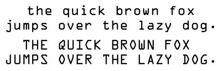
This is what both fonts look like.

What do you use OCR-A and OCR-B for?
Obviously both fonts go well with bar codes or designs for credit cards. Its distinct look also makes OCR A suitable for use in advertising, display graphics, or covers. It has a kind of retro-futuristic look to it. OCR B is less flashy but still popular for projects that require a more technical appearance.
The history of these OCR fonts
The OCR-A font was designed for usage by OCR applications in an era when computers still had far less horsepower than they have today. All characters have the same thickness and width. To improve the recognition accuracy all the glyph or character shapes are distinctly different. This explains, for instance, the funny look of the uppercase ‘Q’. The original version of OCR-A was released by ATF in 1968 to meet the specifications of the U.S. Bureau of Standards. Nowadays there are several implementations from different foundries, one of which ships with Microsoft Vista. Several regulation bodies including the American National Standards Institute (ANSI), ISO, and DIN have standardized the font.
Adrian Frutiger designed OCR-B, the European counterpart, for Monotype. It was meant to be easily readable by both machines and humans. It became an international standard in 1973.
Trivia
Got funny anecdotes about these fonts? Add a comment below!
Other sources of information
MyFonts Musings has the nicest page about these fonts, including examples of similar fonts such as MIRC.