Photo typesetting makes enormous strides forward during the seventies. Computer-based front-ends are combined with sophisticated electronic typesetters. The Mergenthaler VIP, launched in 1970, is a prime example of this trend. All those galleys of type and other artwork are combined on a single page in a manual process called paste-up.

The Mergenthaler VIP or Variable Input Phototypesetter is a compact photomechanical typesetter that costs around 20,000$. A tape reader is used for input, driving a strobe light that exposes letterforms from a negative film strip onto a roll of photographic paper. Once exposed this results in a galley, a strip of paper containing a single column of typeset text. The paper tapes that the VIP reads are created by a compositor on a separate keyboard.
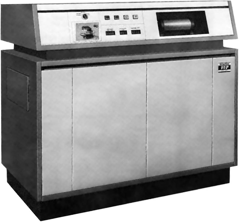
The VIP typesetter is often combined with a Datapoint 2200 computer for data entry. This machine can be equipped with a paper tape unit. A composer enters all the text on the computer and then takes the resulting tape to the VIP for output.

Edward Ronthaler, Aaron Burns and Herb Lubalin found the International Typeface Corporation (ITC). It becomes one of the largest type foundries in the market, marketing both new designs as well as revivals of older typefaces such as Garamond. In 1986 the company was acquired by Esselte Letraset. Nowadays its collection is owned by Monotype Imaging.
Another well-known company that is founded that year is ECRM who introduce the Autoreader, an OCR reader that can scan typed documents and generates properly coded output for a phototypesetter. This allows articles written by journalists on a typewriter and corrected by an editor to be used as direct input, without the need to retype the article once more.
US company Datacolor is founded in Lawrenceville, NJ. It develops solutions for industrial color challenges.
Xerox PARC computer laboratory opens in Palo Alto, California. It will be hugely influential in the next decade.

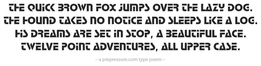
Stop is a futuristic sans serif display font designed by Italian type designer Aldo Novarese and strictly meant for headlines and logo work.
 Another typeface typical for that era is Quartz, released by Linotype.

These are some important or remarkable events from 1970:
- Anwar Sadat becomes President of Egypt, Salvador Allende is elected President of Chile.
- The Nuclear Non-Proliferation Treaty is ratified by 56 nations.
- The Beatles split after releasing their 12th and final album, Let It Be.
- An explosion in the Apollo 13 spacecraft forces the crew to abort the mission.
- In Cambodia a civil war begins with the Khmer Rouge.
I ran two of these buzzing clattering beasts back in the early 1980’s at Deslandes Ltd (part of the NZEI back then) in Wellington, New Zealand. I also kept the darkroom going, replacing developer and film was the easy part, cleaning the transport racks could be troublesome. I still get the little blisters under my skin from the chemicals that were used (H&S?). We had a good collection of fonts but they did tend to breakdown even though they were regularly serviced. The paper tapes were fun to chase around if you dropped them too. Happy Days…
I Graduated in 1989 with certification in Commercial Arts. Macintosh was on the Sean and I remember Compugraphic I recall thinking, why are we doing color separations, type all this stuff by hand there has to be a better way, a computer should be able to do this. 4 decades later I’m grateful for having the privilege’s of learning the process and sharing a time when so many people contributed to the creative process of Print, Television and Entertainment,
I had the privilege of operating the Merganthaler VIP at Poor Richards Press in San Luis Obispo. Brian Lawler was my boss who taught me how awesome the Merganthaler VIP was. I enjoyed operating this machine. I would feed the tape in, choose my font, and when it was finished it would fill the typed film in a canister that I would then develop in the dark room. I loved this job! I also created the rubber stamps at the shop. I also remember how Mr. Lawler photographed panoramas. He created a poster of us at the shop that years later I saw posted on the wall of another little print shop. Great memories!
Thanks for sharing!
My shop originally had Compugraphic phototypesetters. Our three major competitors had VIPs. We could never get business from most of the artists and “better” companies because the Compugraphic fonts were mostly “rip off” of the “quality” fonts from Mergenthaler. Mallard, for example in place of Melior, etc. Then, our main Compugraphic unit began to produce “baseline bounce” so the output could not be sold. After six months of the tech failing to find and correct the problem, we had a big hit to our bottom line; we “survived” only because we had some 2600 2″ headline fonts, way more than any competitors. I ordered a VIP and the MVP which Merganthaler had just brought to market. The Merg techs had it set up by the day after the system arrived, and I sold the first galley that afternoon. Within a few days, our “headline” customers were bringing their body type jobs, also. Within a year, our business increased almost 10-fold. We were one of only a handful of shops that had the working VIP/MVP system.
No mention of Compugraphic? That were the game changer in the photosetting market due to their aggressive pricing.
I have too many colleagues with a Compugraphic background to be able to ignore the company. You’ll find references to Compugraphic from 1960 onward, when the company was founded. There were just no major announcements in 1970.
I went from Singer-Friden to Mergenthaler to Compugraphic. And, when I started my own ‘Pre-press business’ it was an Agfa-Compugraphic.