When I first started using a Mac, the wide range of high-quality typefaces that were available for it fascinated me. Imagine how annoying it was that my boss insisted on the use of Courier as the company font. He claimed it was the font that our customers were accustomed to and that it made quotes and other documents appear trustworthy. Even thirty years later, those memories are still vivid enough to include Courier in my list of interesting fonts.
What does Courier look like?
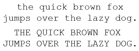
let’s first show this typeface in a small poem. This is the Monotype version.

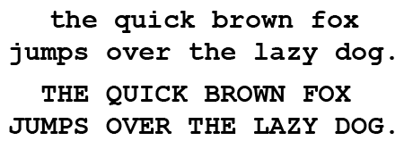
There are some of the variants that are available.

What do you use Courier for?
Courier isn’t a particularly legible typeface, nor does it look modern or elegant. Obviously it is well suited for documents that need to look as if they were created using a typewriter. 🙂 It is also a good choice if you need an old-style government or bureaucratic look.
Since Courier is a monospaced font, which means that all characters have the same width, it can be practical in documents which contain aligned columns of text. There are better monospaced fonts around though, such as special versions of Helvetica and Lucida. If you only need to line up numbers, then there are also OpenType fonts that include both regular numerals and monospaced ones.
Apparently Hollywood screenplays are often written in 12 point Courier.
The history of Courier
Courier was designed in 1955 by Howard Kettler. IBM used it for their typewriters but didn’t secure the rights to the design. Numerous companies copied the font, making it the standard typeface for typewriters. This didn’t stop IBM from having Adrian Frutiger redesign the font for their famous Selectric series of typewriters.
Windows 3.1 contained another updated version of Courier, called Courier New. It was produced by Monotype. In updates of this font, additional glyphs (character shapes) have been added. Version 5 contains over 2700 characters.
Trivia
Originally Courier was called Messenger. Here is what Howard Kettler said about the name change: “A letter can be just an ordinary messenger, or it can be the courier, which radiates dignity, prestige, and stability.”
Other sources of information
Wikipedia has an interesting page on Courier. More information on its use in business communication and screenplays is available in this essay.
< Comic Sans – DIN >
Hi Laurens,
You replied to a query about the date of introduction of a font in a specific country saying “I have no idea and it isn’t a question that is interesting enough to me personally to spend much time trying to find the date.” Your reply suggests to me that you might have some idea as to how to best get an answer for that question — it just wasn’t worth the effort. I understand that position completely. However, this type of question arises fairly often in forensic work when trying to assess ‘old’ documents. That’s what I do (in part). I have some good resources for this but I’m always looking for more. I don’t want to take a lot of your time, but I was wondering if you had a specific set of resources, or a procedure in mind, when you made that comment? If not, that’s fine. If you do, would you mind sharing? Either way, I love the site and content. Good beer is forthcoming should ever we meet. Cheers!
I hadn’t considered that forensic work could be the reason behind such a question. Interesting! Unfortunately I cannot point you to potential resources, I’d be googling around and maybe checking some forums to find such information, just like anyone else.
Will studios accept screenplays written in Courier New 12 point?
I use courier for bash shell for dos and linux Just makes it feel old school
Also it’s more easier for coding.
Code Editors use monospace (or fixed width) fonts. Meaning space occupied by every character is same. ‘I’ occupies same space as ‘w’. It makes code visibility better and indentation easier.
When was courier new font introduced in India? Please inform. Its urgent. Thanks in advance. Waiting.
I have no idea and it isn’t a question that is interesting enough to me personally to spend much time trying to find the date.
I prefer a Monospace font over any and all Proportional fonts!… i.e., the two MAIN FONT CATEGORIES into which all other fonts can– and should!– be grouped! But… there’s a systemic problem with how FOSS-based Text Formatting suites (leaving aside, Closed Source/ Closedware versions of Monospace!) render Monospace, when incorporating Superscript or Subscript (SS/ SS), graphic boxes, and images (but, etc.!)!
Why… in a Monospace Format… when placing superscript (or subscript) characters in LibreOffice (but also, in other FOSS-based programs such as Apache OpenOffice, and AbiWord!), does the “normal point size” typed below and above the line I’m working on, not line up with the “normal point size” I’m ON? So, for example, if I type 10 Xes in 12point (and the 12point, being the larger “normal point size” I’m using), then the word “house painter” (e.g.) in superscript… and then type 5 more 12point Xes to the right of my SS/ SS… then go down one line, and type 12point Xes until I reach the last 12point X typed above… the last 12point X on the second line, won’t align with the last X typed above! A “squeeze-play” has occurred with the SS/ SS characters… wherewith, the 12point vertical spacial alignment to the right of the SS/ SS is no longer contiguous with the 12point vertical spacial justification on the left of the SS/ SS, or below it! In other words, the SS/ SS has created its own vertical spacial justification!… AND D-MN THE VERTICAL SPACIAL JUSTIFICATION OF THE NORMAL POINT SIZE ON THE SCREEN!… AND THUS, D-MN FULL MONOSPACE ALIGNMENT! And… to be clear… it doesn’t matter what larger point size one is using!… the invoking of SS/ SS on one’s computer screen will mean a failure of the alignment of the larger point size!
[ADMIN] The remainder of this comment was removed since the commenting function on this site could not deal with such a long rant. I think the first two paragraphs sum it up nicely
Used to use Courier back in the day for college papers. I had the idea that it would be more familiar to my professors who (I assumed) grew up with typewriters. Also it was easier to fill 20 pages with Courier than with Arial.
“Apparently Hollywood screenplays are often written in 12 point Courier.”
Not often, Courier 12 is the only font the studios accept: It relates to the length of a film, one page of action equals one minute of screen time. Thus a studio can quickly evaluate if a new work is the “right” length, the target is usually 120 pages or 120 minutes. Additional checks are made for the Act One/Act Two boundary, and Act Two/Three boundary, Page 45 etc.
If a script gets ticked off on these points, the film is then passed through to the readers for evaluation (ie, read). Not a foolproof system but screening out thousands of poorly prepared works needs a system.
Courier 12 is right at the heart of that system.