Rotis was one of the first typeface families in which you had a choice of serif, semi-serif, semi-sans, and sans versions. For many years it was the corporate font of Agfa, the company I work for. This made it a natural choice for my list of interesting fonts.
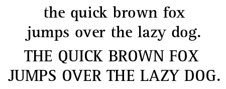
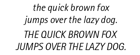
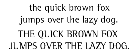
What does rotis look like?


What do you use rotis for?
Rotis is available in so many weights and faces that it is suitable for a wide range of applications. You can use it as a corporate typeface or for books, magazines, newspapers, and display jobs (like posters or advertisements.)
The history of rotis
Otl Aicher designed rotis in 1989 for Agfa. It is named after the German village in which he lived. At its launch, the blending of sans with serif was almost revolutionary. Despite dismissive comments from traditionalists rotis soon became a commercial success, especially in Europe.
Trivia
The name rotis is supposed to be written completely in lower case. Aicher refused to use a capital R because he considered upper case characters a token of hierarchy and oppression.
According to the well-known typeface designer Erik Spiekermann ‘Rotis is not a typeface. It has some great letters, but they never come together to make words that don’t look contrived or uncomfortable. It looks best on gravestones and similar large architectural applications.’
Other sources of information
Check out these two interesting opinions about its usage.
Thanks!