Times New Roman is a serif typeface that has become a classic since it was first put to use in the British newspaper The Times in 1932. It simply has to be present in any list of interesting fonts.
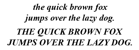
What does Times New Roman look like?


What do you use Times New Roman for?
Times New Roman lends itself for body text in any publication that needs to have a classic yet practical look. Combining excellent legibility with good economy, it is used a lot for books and newspapers. Times New Roman is not very suitable for on-screen usage although it is one of the web-safe fonts judged to be available on every computer worldwide.
Even though nobody ever got fired for using Times, it is one of those typefaces that have been used so much that it annoys some people. Plantin and Musee are interesting alternatives to Times. Georgia is very similar but somewhat wider.
The history of Times New Roman
Stanley Morison together with Starling Burgess and Victor Lardent designed Times New Roman for the British newspaper The Times. Although initially created for newsprint, it quickly became the leading type for books on Monotype, Linotype, and Intertype typesetting machines. Over the years, many variants were added, such as a version for small type (Times Ten), one for office use (Times Europa Office) or for headlines (Times Eighteen).
Its success in the digital era started off with Adobe including a version in the base fonts that shipped with PostScript. Microsoft has also included a version of Times New Roman produced by Monotype with every copy of Microsoft Windows since version 3.1. The version that ships with Windows Vista is a greatly expanded version that contains over 3300 glyphs.
Trivia
True to the somewhat stuffy nature of this font, I couldn’t find any amusing stories or anecdotes involving Times New Roman.
Other sources of information
There is obviously a Wikipedia page.
With a few tweaks, you can also use Times New Roman as a web font for website design. Times New Roman has been abandoned as a modern web font, although it has been heavily used decades ago. It’s still a newspaper font, but it’s slowly being retired. See here – https://getbutterfly.com/times-new-roman-enhanced-css-font-stack/
Times New Roman is the most ubiquitous type in print and therefore the most familiar and therefore the most comfortable to read in general.
The most obiquitous? That might very well be the case. The most comfortable? I think that is something personal and not determined by popularity.
What do you mean there were no interesting stories? What about how it was allegedly designed by Burgess almost thirty years before the release of Times Roman by Stanley Morison?
great help to me!
of great help to me!
Serif fonts in general have low readability for on-screen copy, but good readability for print. The opposite is true for sans-serifs.
You say:
“Times New Roman is not very suitable for on-screen” usage”. Why?
The curly bits become blurry unless you have a super high res screen.