Verdana is a sans-serif typeface that I often use in e-mails or text documents that are mainly consulted on-screen. That is why it made it to my list of interesting fonts.
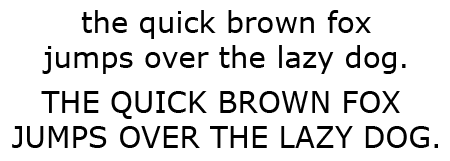
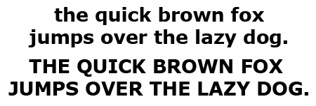
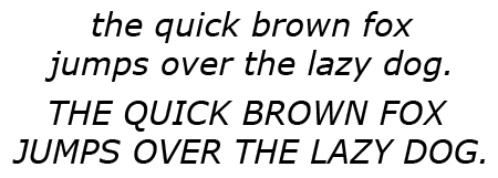
What does Verdana look like?
What do you use Verdana for?
Verdana was created primarily for viewing on computer monitors. It is a very clear and legible font. This is partly due to the fact that its characters are fairly bold and wide. This also makes the use of Verdana a bit controversial. Since it looks great at small font sizes, substitution fonts can be quite illegible on systems that do not have Verdana installed.
Verdana is suitable for use on low-resolution output devices, such as laser printers. Avoid it for stuff that will be printed in offset or for documents in which a lot of text needs to be crammed in a limited amount of space.
The Tahoma typeface resembles Verdana and can be used as a substitute. Georgia is another alternative.
The history of Verdana
Verdana was designed for Microsoft by Matthew Carter, with the help of Tom Rickner. Since 1996 it has been included in all versions of Windows, Office and Internet Explorer.
Trivia
The name Verdana partially refers to verdant (something green, such as the region around Microsoft headquarters in Seattle).
Other sources of information
There is a Wikipedia page on Verdana. Here is an interesting page on the use of various fonts for e-mail or web pages.
Wow, this is cool. I love history even in the simplest font. 😉
I always used Verdana front for work as it looks attractive and easy to catch mistakes. I am working as a freelancer IT expert in Juno email. For instant response in Juno Email Not Working issues follow to this link:- http://www.emailhelpdesk.co/juno-email-not-working/
thank you for the information =)