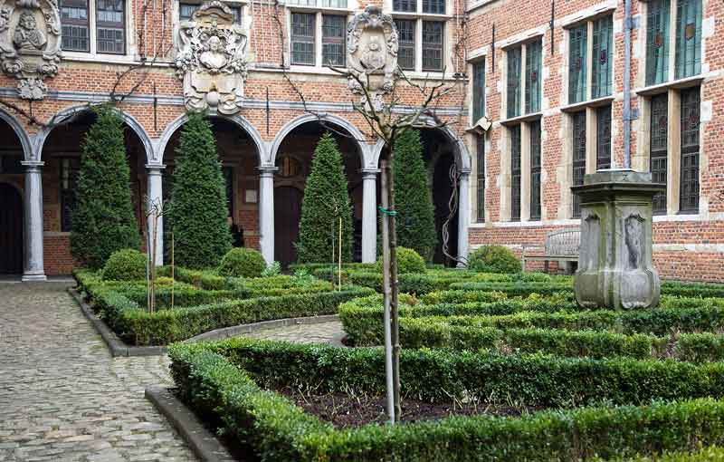
The Plantin-Moretus museum in Antwerp, Belgium is one of the nicest printing museums in the world. Below are pictures from two visits during 2008 and 2009. The first time I focused on the collection of books and type. After buying a wide angle lens, I returned a second time to photograph the building itself. Below is the courtyard with the living quarters to the right and the store where books were sold straight ahead.
The beauty of this place is that it is, in fact, three museums in one:
- The house itself is a fascinating building with lots of creaking oak floors, small lead-in-glass windows and tapestries on the walls.
- The museum has a huge collection of old books as well as the entire archives of the Plantin business. Christoffel Plantin became a printer and publisher in 1555. In just a few years he managed to expand the company so that it had sixteen presses and seventy employees. They printed bibles as well humanist and scientific publications. His successor and son in law, Jan I Moretus, became famous for having printed the Moerentorf Bible, the official catholic Bible edition which remained in print until far into the 18th century. The family remained in the printing business until 1866.
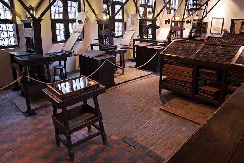
- Last but not least there are the 17th-century bookshop, the letter foundry, corrector’s room and press room. The museum houses the two oldest surviving printing presses in the world and complete sets of dies and matrices.
The most interesting room in the museum is the press room, with a series of old presses on one side and type cases on the other. Like most other rooms it is badly lit, which is great for evoking the atmosphere of the previous centuries but this does make photography a bit of a challenge.
From time to time one of the presses is still operated. The second press on the above picture was ready to print the French poem below. Being able to read wrong-reading text is a skill that even I still picked up from working with film.
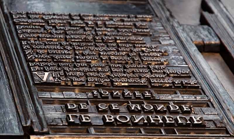
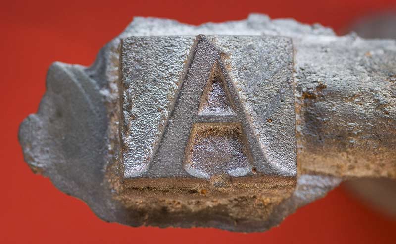
Plantin’s books were known for their exceptional typographical quality. Christopher Plantin used to be a regular customer of Claude Garamond, whose designs are considered to be the height of typographical elegance. It is fascinating to look at old type and compare its ‘organic’ look to the smooth curves, straight angles and sharp edges of current typefaces. It is also funny to try and decipher old Dutch or French text. Once you get used to the ‘f’ shaped ‘s’ glyph and other typographic oddities, 300 year old text is sometimes remarkably easy to read.

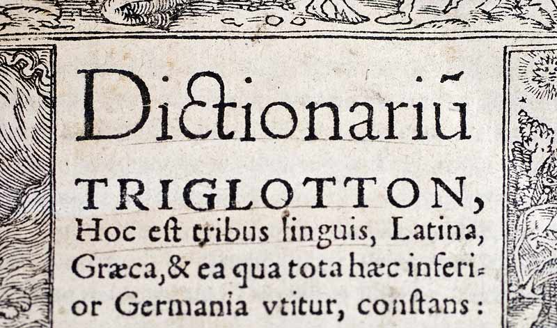
Next to lead type, the museum also has a collection of copper engravings that were used for the covers of books. Peter Paul Rubens, the Baroque painter, made the sketches for some of these. There are many bibles, dictionaries and encyclopedias on display. The example below is part of the cover of a multilingual dictionary, with a beautiful ‘ct’ ligature in its title.
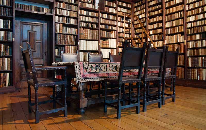
The museum has a collection of over 3000 books. Many of these can be found in the two library rooms. The ‘big library’ looks like a place where I could happily spend all my evenings.
There are separate rooms in the museum which contains examples of various types of illustrations. Both carved wooden blocks as well as the printed result are on display. I like this example which was used in an encyclopedia.

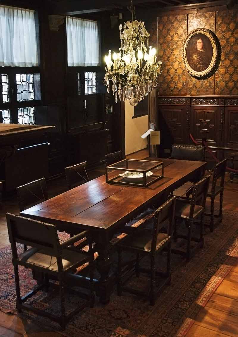
In the past printing was a pretty profitable business. There are a couple of dining rooms in the building that clearly show off the wealth of the family.
Most of the books on display are black & white but there are some fascinating books in color as well. Unfortunately I couldn’t photograph the most interesting ones. Spot colors were either added manually or printed using separate woodcuts or copper engravings.

There is a fully equipped letter cuttery on the second floor of the museum. From the stairs I shot this picture of the empty foundry room.

Hendrik Van den Keere was a famous Flemish punchcutter whose Flemish blackletter remained popular for 3 centuries. He cut his larger type sizes from a wood block and then cast the letters in sand.
If all of this overwhelms visitors a bit, there is always the possibility to take a little nap in the master bedroom.

To see more pictures of the museum, visit the ‘Plantin-Moretus revisited’ page. There is also a main page listing all the places where I took pictures of printing museums.
Thanks so much for sharing your pictures. I’m planning a day trip to Antwerp, and your glimpse into this museum intrigues me. I’ll definitely include it in my itinerary. Thanks again!
This is wonderful, the day I went there it was closed and my schedule didn’t allow me return. Now I know that I must return.
This is great stuff! Thanks for helping me plan my next adventure!
> If you know more about color printing in the 16th century, please add a comment at the bottom of this page.
I believe that spot colors, for illuminated initials and such, were applied by hand with a brush during this period. It certainly looks like that in the example you show.
Thank you for sharing the beautifully captured images.