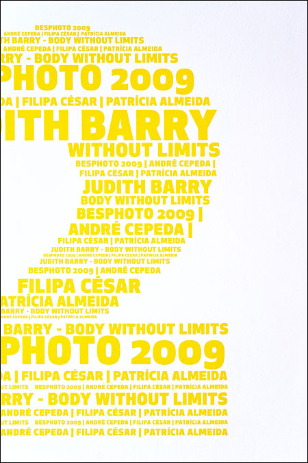
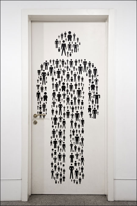
During a recent trip to Portugal, a few beautiful examples of typography caught my eye. Below are some photographs of this. What I like about Lisbon is that it seems to keep its original character, despite the obvious influences from elsewhere. You can find all the international chains in the shopping streets and television looks pretty much like anywhere else. Yet the city and its inhabitants seem to be capable of sticking to their own habits and style. I really hope it stays that way.
The good…
Let’s start with some older stuff.
Bertrand’s Bookshop (‘livraria’ in Portuguese) was founded in 1732. It is now a national chain of book stores but the main store can still be found on Rua Garrett in Chiado, the traditional shopping area of Lisbon. I was a bit reluctant to photograph the interior which is a pity since it is one of the nicest bookshops I have ever seen (pictures from the most beautiful one can be found here).
Ceramic tiles are used a lot for decorating houses in Lisbon. Even a lot of street signs are made of tiles. We saw this nice sign while walking to Castelo de São Jorge (Saint George’s Castle) which overlooks the city center.
Belém is the city quarter from which many of the great Portuguese explorers embarked on their voyages. Next to a beautiful castle and monastery, you can visit the Centro Culturala de Bélem, a very large cultural center. There was an art exhibition with portraits and other pictures made by Annemarie Schwarzenbach, a Swiss writer, journalist, and traveler. I could have spent an entire afternoon reading her life story and watching her photographs. Instead, my wife and daughter insisted that we should go buy Pastéis de Belém instead. Yummy!
In the same cultural center, I was more impressed by this poster than by the actual pictures that were shown.
The art exhibition with works by Robert Longo, on the other hand, was just fantastic. You can see samples of his work on the artist’s web site.
….the bad…
Was all typography in Lisbon that beautiful? No, of course not.
The worst example that I saw was a poster in English which mixed some very odd spacing with a series of horrible typos. Where was this masterpiece to be found? Unfortunately, it decorated the entrance of an exhibition at the Museu do Design e Moda – the Museum of Design and Fashion!
… and the funny
That piece of crap instantly made me want to return to the Centro Cultural de Belém, where even the toilet was a playful display of how much fun graphic design can be.


Hey, I’m from Portugal :p, if you like roman kind typography and such you should come to Braga. One the oldest cities in the world. Great work with the typography of Lisbon. :). Found your blog today I’m going see it more deeply.