DIN started out as a signage font but is nowadays used for a wide range of jobs. It is part of my list of interesting fonts.
What does DIN look like?
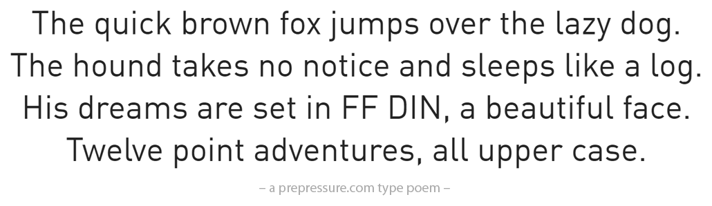
The version used in this type poem is from the FontFont library.
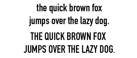
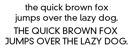
These are some other versions.

What do you use DIN for?
Even though the DIN typefaces are very legible and easy to reproduce, there is some discussion about their aesthetic qualities. Use DIN for signage or any type of work in which you need an industrial, slightly severe look. If you need something a bit more playful, try Officina Sans.
The history of DIN
DIN stands for Deutsches Institut für Normung (German Institute for Standardization.) The DIN 1451 typeface was designed in 1936 for road and railway signage. It remained in use for German number plates until 2000. Linotype markets a digital version of the original font while Albert-Jan Pool created a very versatile family of DIN typefaces (FF DIN) for Fontshop. FF DIN is more geared towards commercial applications.
Trivia
DIN is used on the packaging of Half-life, the computer game that ate all my spare time around 2000/2001.
Other sources of information
Eleven-Seventeen has an interesting page on the history of FF DIN. IDSGN shares some nice pictures of its use.