Avant Garde is a geometric sans serif type that is reminiscent of the work from the 1920s German Bauhaus movement. Its distinct look and popularity make it an obvious choice for my list of interesting fonts. The typeface should be referred to as Avant Garde Gothic but I prefer to leave that last part out.
What does Avant Garde look like?
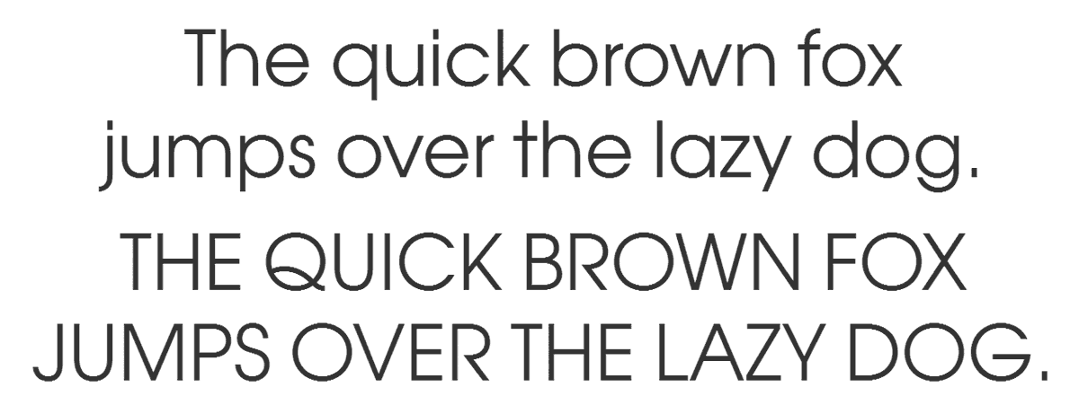
This is what Avant Garde Book looks like with a few lines of text.
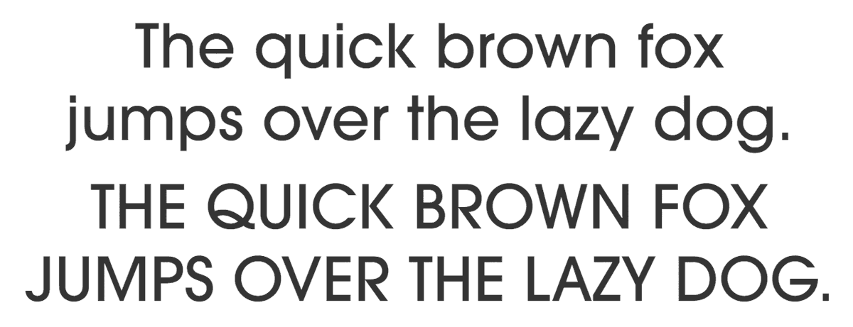
Of course, Avant Garde is available in a wide range of weights:
What do you use Avant Garde for?
Avant Garde is a display font, meant to be used for headlines and short texts. Use it if you need a retro 70’s look or want something that really stands out. It can be pretty difficult to actually use this font the way it was intended to be used. This comment from Ed Benguiat sums it up nicely: “The only place Avant Garde looks good is in the words Avant Garde. Everybody ruins it. They lean the letters the wrong way.”
Looking for alternatives? Take a look at Fedra Sans Display. Another option is ITC Lubalin Graph, a slab serif font that retains the geometric appearance and large x-height of Avant Garde Gothic.
The history of Avant Garde
Herb Lubalin and Tom Carnase designed Avant Garde around 1968. It was based on Lubalin’s logo for Avant Garde magazine. The original face was all uppercase. Avant Garde was the first typeface released by ITC when the company was founded in 1970. Next to being used in all types of art publications, Avant Garde was a classic in ’70s advertising design.
Additional versions include the condensed fonts which were created by Ed Benguiat. The OpenType version of Avant Garde Gothic Pro that was released in 2005 includes a suite of additional cap and lowercase alternates as well as new ligatures.
Avant Garde trivia
None found yet.
Other sources of information
The Wikipedia article is a bit dull. A brief history of Avant Garde is an interesting read though, as is Avant Garde, Then and Now.


Great font
Very good info…thanks