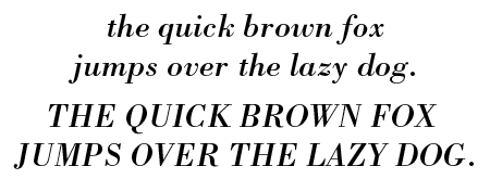
Bodoni is the name of a series of serif typefaces that you often see used on posters. I am not particularly fond of it but given its importance in the history of typography, it had to be in my list of interesting fonts.
What does Bodoni look like?
This is what the Linotype version looks like.

These are examples of different styles.


What do you use Bodoni for?
The unique style and very pronounced contrast between thin and thick strokes make Bodoni suitable for displays (Poster Bodoni), headlines or logos. The book versions are, as their name implies, also used for body text.
Filosofia is an interesting alternative, especially for body text.
The history of Bodoni
During the 1790s Italian publisher and typographer Giambattista Bodoni designed a series of serif typefaces that came to carry his name. Over the years a number of foundries created new versions of the typeface. These include Adobe, ITC, Bauer and FontFont.
Trivia
On April Fools’ Day 1977 the Guardian, a British newspaper, published a story about a fictional island nation called San Serriffe. Bodoni, its capital, was located on one of the northern islands (Upper Caisse). Among its famous inhabitants are General Pica, Pierre Myriad and San Serriffe’s current leader, Mr. Bourgeois.
Other sources of information
CreativePro has an interesting article on using Bodini.
