Comic Sans is a script typeface that is used inappropriately so much that it is probably the most hated font in the world. That makes it an obvious choice for my list of interesting fonts.
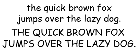
What does Comic Sans look like?
Here is a little poem to show off Comic Sans.
Of course, several styles are available. Below the regular and bold versions are compared.
What do you use Comic Sans for?
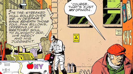
As its name implies, Comic Sans is a good choice for comic book style talk bubbles. It can also be used as display type for anything that needs to have a friendly and informal look to it. It is not very suitable for e-mails, body text, presentations, name cards for anyone over 12 or corporate communication.
However, in 2010 a team of Princeton psychologists did a series of tests on disfluency — making material harder to learn to improve long-term learning and retention. In the study, the researchers changed the fonts on supplementary classroom material, such as PowerPoint presentations, handouts, and worksheets. For certain tests, the usual Helvetica and Arial were replaced by a variety of disfluent formats, such as Monotype Corsiva, Comic Sans Italics, and Haettenshweiler. After several weeks the students were tested on their retention of the material. In every class except chemistry, the students in the disfluent condition performed significantly better than those in the control-fluent condition. Using an inappropriate font such as Comic Sans might actually help students retain what they’ve learned.
The history of Comic Sans
Vincent Connare created Comic Sans in 1994 while working for Microsoft. It was designed for ‘Bob’, a virtual assistant that would help kids and novice users launch programs and do simple tasks. Connare used the lettering of ‘The Dark Knight Returns’ and ‘Watchmen’ comics as a source of inspiration and originally even intended to name the font ‘Comic Book’.
In the end, Microsoft did not use Comic Sans for the virtual assistant but it did use it in a number of other Windows ’95 related products, including Internet Explorer. The typeface quickly became very popular but it was abused so much that an anti-Comic Sans movement erupted.
Trivia
For some time, Apple used Comic Sans for its iCards service.
Other sources of information
Bancomicsans.com is more fun than the Wikipedia page on Comic Sans. If you don’t mind downloading the 10 MB file, Vincent Connare’s own Ihatecomic presentation is worth reading. Far less serious is ‘I am Comic Sans, asshole‘. Wired has a good article about the above-mentioned benefit of using ugly fonts.


Well, that bunny is probably pulp by now as I use Comic Sans as my default font. Love it. It looks casual and easy to read.
could you share a document with it on it, just to share the font? I heard that if you have an old document in comic sans you can make it a default and then keep using it from there but I don’t have any and I desperately want to use it. no pressure if you can’t ! ^^