Futura is a sans-serif typeface that even 80 years after its creation still has a decidedly modern look. No wonder it made it to my list of interesting fonts.
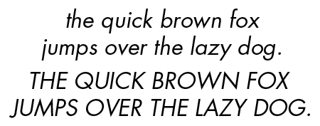
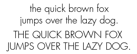
What does Futura look like?
These are some of the variants that are available
What do you use Futura for?
Its distinct look and good readability make Futura a good headline font, but it is often also used for body text. Avenir, Avant Garde, Gill Sans and Kabel are good alternatives to Futura.
The history of Futura
German typeface designer Paul Renner designed Futura in the mid-1920s. Its geometric shapes were inspired by the Bauhaus, the German arts&crafts school/movement. The font was commercially released in 1927 with additional weights being added in the years after. Many foundries, including Adobe and URW, offer digital versions of Futura. Neufville claim to sell the most authentic version.
Trivia
In 1969 the Apollo 11 astronauts left a commemorative plaque on the moon. Its text was set in Futura.
Back in the ’90s, people got so sick of Futura Extra Bold Condensed that there was a movement called ‘Art Directors Against Futura Extra Bold Condensed’.
Other sources of information
There is a Wikipedi page on Futura.
There is also an interesting book, titled Never Use Futura. According to its blurb, it chronicles Futura’s uses from its avant-garde beginnings to its mid-century triumph and its present-day nostalgic, critical, and forward-looking uses.
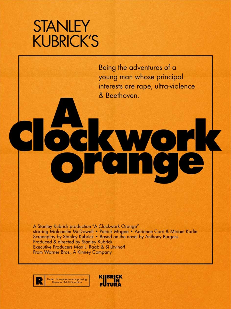
The idsgn page is fun to read, as is Kubrick in Futura.


nice work