Helvetica is one of the most widely used sans-serif typefaces. That is why it is one of the typefaces that made it to my list of interesting fonts.
What does Helvetica look like?
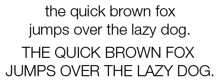
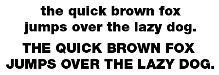
This is what the revised version of Helvetica looks like.

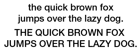
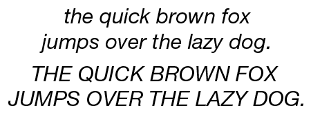
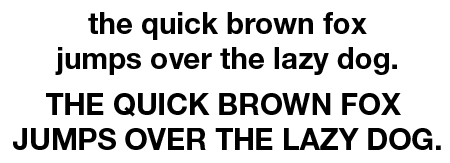
These are some of the available variants.
What do you use Helvetica for?
‘When in doubt, use Helvetica’ used to be a common rule. The typeface was designed for use in short pieces of text, like headlines and advertisements, but many people also use it for body copy. Some critics, however, don’t think it is suitable for lengthy blocks of text at small sizes.
If you’re looking for contemporary alternatives, check this page that recommends Post Grotesk, Akkurat, Atlas Grotesk, Suisse Int’l, Theinhardt and Aktiv Grotesk. The article discusses their use on the web but these look to be nice fonts for print as well. Neue Haas Unica is another great alternative.
The history of Helvetica
When older sans-serif typefaces such as the German face Akzidenz-Grotesk became popular in the 1950s, The Haas Type Foundry in Switzerland commissioned Max Miedinger to draw an updated sans-serif typeface. With the help of Edüard Hoffmann, he designed a font that was originally called Neue Haas Grotesk. Its name was later changed to Helvetica. During the 60s Linotype heavily promoted it as a modern, progressive typeface. More weights were added, extending the versatility of the typeface. Helvetica became one of the most popular typefaces in the world. Many foundries made look-alikes, such as Triumvirate, Helios, Megaron, and Newton.
In the early eighties, Adobe added Helvetica to the core fonts that shipped with every PostScript RIP (along with Times, Courier, and Symbol).
Because the various weights of Helvetica were drawn by different designers and were pretty inconsistent, Linotype created Helvetica Neue. This reworked version has more and more consistent weights than Helvetica. The series of weights are named using two-digits (e.g. 55=Roman, 65=Medium, 75=Bold,..), similar to the Univers family. Some of the glyphs were also tweaked slightly: the O doesn’t look like it wants to fall over and some characters seem to be slightly more rounded.
In 2017 Monotype launched Neue Helvetica World, a version supporting 181 languages and geared towards international usage by large corporations or publishing houses.
Monotype launched a major overhaul of Helvetica in 2019, redrawing all characters with an emphasis on improving the legibility of small type sizes. This new version is called Helvetica Now. It is available in three optical sizes: Micro, Text, and Display.
Helvetica trivia
The name Helvetica is derived from Helvetia, the Latin name for Switzerland. There is even a movie about Helvetica (and typography in general). Many companies, including KLM, use Helvetica as their corporate font.
Other sources of information
There is a rather long Wikipedia page about Helvetica. The simplicity of Helvetica is a much more interesting read, as is this point of view about its deficiencies and dullness. If you are in the mood for a long article, read this one on the use of Helvetica in the New York subway system. Another interesting find was this page on how to pimp your Helvetica. Mike Parker is often called the godfather of Helvetica. The reasons behind that can be found on this page.
< Gill Sans – Kuenstler Script >
when i die, im probably going to hell(vetica)