Page dimensions: Make sure you use the exact dimensions that the customer specified for the job. Also take care that the proper bleed is applied on all pages. Don’t be sloppy but use an identical value (e.g. 5 mm) throughout the document.
Page numbering: Odd pages are on the right hand side, even pages to the left (don’t laugh, I have seen documents in which this basic rule was forgotten.)
Folding panels: Be aware of folding panels. Not all pages in a folding panel have the same size! Do your work at the exact size of the printed piece and allow for proper margins where you want it to fold.
Dot gain: Imagesetters should be set up to give linear output. This means that if you use a 50 percent flat on a page somewhere, the output on film or plate should also measure 50 percent. The printing process, however, is not linear. Due to the pressure of rollers, the absorption of ink by the paper and some optical effects as well, that 50 percent flat may well get printed as a 65 percent. The actual percentage of dot gain depends on the paper used, speed of the press, screen ruling, operator, the type of press used, the quality of blankets and other parameters. A dot gain of about 10 to 16 percent is not uncommon in sheetfed offset printing. For newspaper printing, this dot gain can even grow to 30 percent. Most (all?) scanner software uses default settings that compensate for the average sheetfed offset printing dot gain. Your layout should take the dot gain into account as well, especially if the job will be printed on various types of paper and presses. Consult your printer before starting critical jobs.
Color
Spot colors: Most printers keep a supply of ‘standard’ Pantone colors. Using these colors in a job can be much cheaper than using a specific PMS color that has to be ordered separately.
Spot colors in a CMYK job: If you use a number of Pantone colors in a job that will be printed in CMYK, you should mark these colors for separation in the layout program. This is especially true if you are using transparency in InDesign. Refer to the manual of your layout application for the correct procedure to mark colors for separation.
4+ colors: If your jobs will be printed in more than 4 colors, it may be worth to talk to a couple of printers. Not only may some offer you a better price because they have a 6 or 8-color press but they can also tell you how your design has to be adapted so they can easily print the additional colors.
QuarkXPress red, green and blue: Never use the Red, Green and Blue colors from QuarkXPress. These are RGB-colors that are routinely switched off by prepress operators.
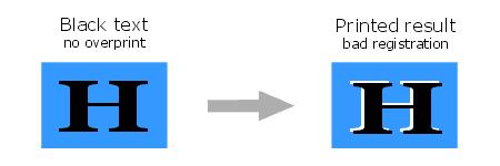
Black in overprint: In most cases, black text, lines and fills that overlap colorized backgrounds should be set to overprint. If this is forgotten, it may cause white spaces when the job is printed out of register.
Rich black: For small black objects that are partly positioned on a light background and partly on a darker background, it is better to use a “rich black”. This is 100 percent black with 40 percent cyan and/or magenta added to it. This way the background does not shine through the black object. The top bar in the example below shows the problem. You can find more info about rich black on this page.
White set to knock-out: Older versions of QuarkXPress had the annoying habit of forgetting to switch off ‘overprint’ settings when black text is changed to another color. This can cause the text to disappear. Make sure white text is set to ‘knock-out’. Most modern workflows used by printers can automatically detect and fix this problem but that knowledge won’t help you much if your job gets printed by the only printer in town who can’t fix this automatically.
Naming conventions: When you use spot colors in a file, their names should only contain the standard 27 characters of the alphabet and numerals to 0 to 9. Use an underscore instead of a space if you want to separate words in the name of a color. Using brackets of any kind can lead to various PostScript problems on some systems.
Color matching: Some colors like clear oranges, violets, and greens as well as a significant part of the Pantone colors that exist are difficult to match in 4-color CMYK printing. Unless carefully calibrated, monitors always show brighter and more saturated colors than can be achieved in printing.
It appears to me that this website doesnt download on a Motorola Droid. Are other folks getting the exact same problem? I enjoy this website and dont want to have to miss it when Im away from my computer.
We’ve just produced a handbook for designers. It answers a lot of the questions here. We’ve included printed examples of things like: different rich blacks, trapping, overprinting, line weight limits, point size limits with different colours and more.
Found you by pure chance and good luck! Love the info, easy to read, understand, interesting and with a sense of humour which you really need in this industry sometimes ha ha.
Great stuff, thanks.
Are you on facebook, twitter or linkedin at all?
Thank you for the effort you have put into this site. I was looking for well-organized stuff to pass onto our prepress operators so that they would send me good PDF files to run through our digital presses. For example, a 100-page file sent to me would not work. They made several attempts to improve the file until one did work, but took an hour to rip. In frustration, I took the PDF file, optimized it (reducing size from 103MB to 19MB), ripped it in 10 minutes, and produced an acceptable proof. In the past week, I estimate I have wasted 10 hours in a 60-hour week because of bad PDFs.
I found your blog on google and read a few of your other posts. I just added you to my Google News Reader. Keep up the good work. Look forward to reading more from you in the future.
I have had and encountered remarkably few problems with transparency myself. That is probably a coincidence as it is a favorite topic in many prepress discussions.
Two of the suggestions which I see pop up regulary:
– As a general rule, make sure that text in InDesign is all put in a separate layer which is the topmost layer.
– Don’t mix different color models when using transparency. For example: don’t put text that is CMYK (or just K) with a drop shadow on top of a background which is defined using spot colors. A lot of problems can be avoided by correctly defining colors in the InDesign Ink Manager. You can use spot colors in InDesign but if they are going to be printed in CMYK, define the colors as being separated right from the start. I have gotten around a few issues with white rectangles appearing in the background by redefining the colors properly in an InDesign job. Maybe that is what your printer does as well?
One recurring issue I have is with drop shadows, particularly in InDesign which look fine on lasers, but when run to digitals often ‘block out’ the vignette area as a flat colour. Printers usually manage to solve the problem, but are not able to supply me with an explanation as to the cause.


good post
It appears to me that this website doesnt download on a Motorola Droid. Are other folks getting the exact same problem? I enjoy this website and dont want to have to miss it when Im away from my computer.
Hi guys,
We’ve just produced a handbook for designers. It answers a lot of the questions here. We’ve included printed examples of things like: different rich blacks, trapping, overprinting, line weight limits, point size limits with different colours and more.
I just thought it might be useful to people here. Do check it out at: http://www.printhandbook.com
Andy
Found you by pure chance and good luck! Love the info, easy to read, understand, interesting and with a sense of humour which you really need in this industry sometimes ha ha.
Great stuff, thanks.
Are you on facebook, twitter or linkedin at all?
very nice and useable information. thx
Thank you for the effort you have put into this site. I was looking for well-organized stuff to pass onto our prepress operators so that they would send me good PDF files to run through our digital presses. For example, a 100-page file sent to me would not work. They made several attempts to improve the file until one did work, but took an hour to rip. In frustration, I took the PDF file, optimized it (reducing size from 103MB to 19MB), ripped it in 10 minutes, and produced an acceptable proof. In the past week, I estimate I have wasted 10 hours in a 60-hour week because of bad PDFs.
I found your blog on google and read a few of your other posts. I just added you to my Google News Reader. Keep up the good work. Look forward to reading more from you in the future.
Drop shadows = transparency
I have had and encountered remarkably few problems with transparency myself. That is probably a coincidence as it is a favorite topic in many prepress discussions.
Two of the suggestions which I see pop up regulary:
– As a general rule, make sure that text in InDesign is all put in a separate layer which is the topmost layer.
– Don’t mix different color models when using transparency. For example: don’t put text that is CMYK (or just K) with a drop shadow on top of a background which is defined using spot colors. A lot of problems can be avoided by correctly defining colors in the InDesign Ink Manager. You can use spot colors in InDesign but if they are going to be printed in CMYK, define the colors as being separated right from the start. I have gotten around a few issues with white rectangles appearing in the background by redefining the colors properly in an InDesign job. Maybe that is what your printer does as well?
Great site – really worthwhile and useful!
One recurring issue I have is with drop shadows, particularly in InDesign which look fine on lasers, but when run to digitals often ‘block out’ the vignette area as a flat colour. Printers usually manage to solve the problem, but are not able to supply me with an explanation as to the cause.
with thanks