These comments and polls appeared on the home page or in the Twitter feed of Prepressure.com during 2017. A separate page covers the 2017 prepress news.
Banknote of the year
There is always room for the ‘banknote of the year’ on the history pages of this site. For the second year in a row the honors go to Switzerland, this time for their 10 Franc note.

Celebrating the twentieth anniversary
In 1997 I got so fed up with troubleshooting RIP issues and the lack of information about this topic that I decided to create a site about PostScript errors. Twenty years and over 16 million page views later, I am still busy adding pages and updating content. Thanks for coming by and don’t forget to check out new articles from time to time in the next 20 years!

One for the text books
Normally mistakes with filler text involve Lorem Ipsum but any placeholder text can be overlooked in the rush to get to press. It cannot get much worse than this, tweeted by @ChrisRandWrites.

Prepress Pete is tweeting
Friday flashback: MacPaint blew me away when I first saw it – prepressure.com/prepress/histo… #Apple #history #prepress

Social media poll
Print.de is asking visitors which social media channel is the most relevant for printing companies. I am actually curious about that myself but think that for this site expanding the scope to the entire graphic arts industry makes more sense. Please cast your vote in the poll to the right and then like it, pin it, or tweet about it.
The previous poll asked visitors which types of files they send to a printing company or receive as a printer.
Musings on e-reading: cover art

I am slowly working my way through ‘On Paper: The Everything of its Two-Thousand-Year History’. Instead of reading a book covering such a topic on paper – as one would expect – I actually bought the ebook version. It is a bit cheaper and you can download it immediately instead of having to wait for delivery. I can take the book (and a few dozen others) with me in my coat and frankly I don’t really find that paper itself adds that much to the reading experience. There are very few types of paper that have a distinct and enjoyable feel to them and those are never used in paperbacks. The contrast between ink and paper is excellent but on the other hand, my Kindle’s front-lit screen is a joy to read in the evening or on gloomy days. Don’t even get me started on ‘the smell of paper’. I much prefer not to smell books at all.
CONTINUE READING
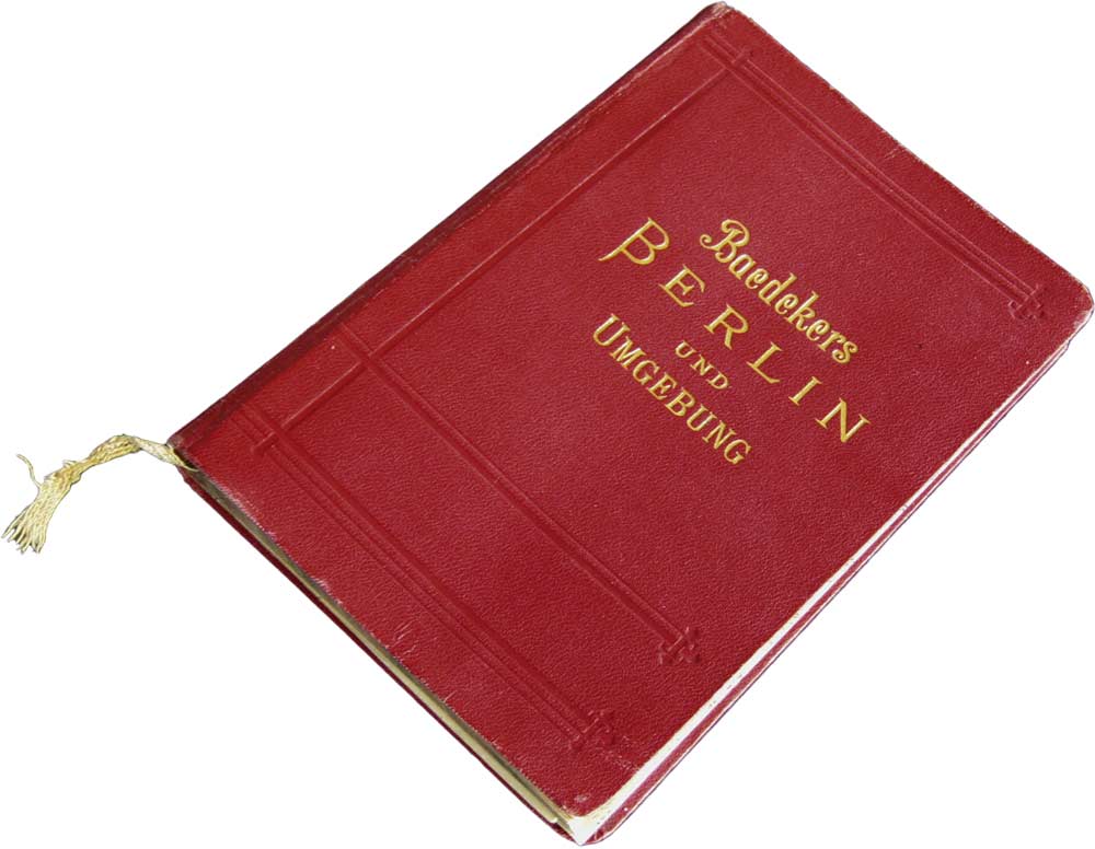
Prepress Pete is tweeting
Friday flashback: For travellers Baedeker guides were ‘the Google of its time’ – prepressure.com/printing/histo… #history #printing #publishing
PDF metadata
Much to my surprise, the page about PDF metadata is one of the ten most popular pages on this site. It needed to be updated and for that, I relied on ‘Developing with PDF’ by Leonard Rosenthol. For PDF-related stuff, you cannot go wrong with a book whose author uses @pdfsage as his Twitter handle.
Interesting graphic arts sites and blogs
The economy is doing well so printers in Germany have trouble finding new employees. To appeal to the current generation of young professionals BVDM, the German Association of print and media, has started campaigns called ‘Gestochen scharf’ and ‘Perfekt veredelt’. As you can see they clearly target the hipster generation and their (assumed?) love for color and detail.

I learned about the above campaign through the newsletter of blokboek.net, an excellent news site about graphic communication. Other interesting resources are Insights4print by Eddy Hagen and the newsletter and blog of Printindustry.com.
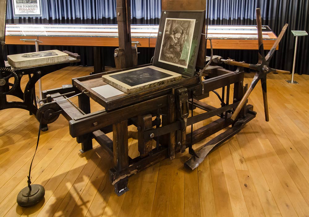
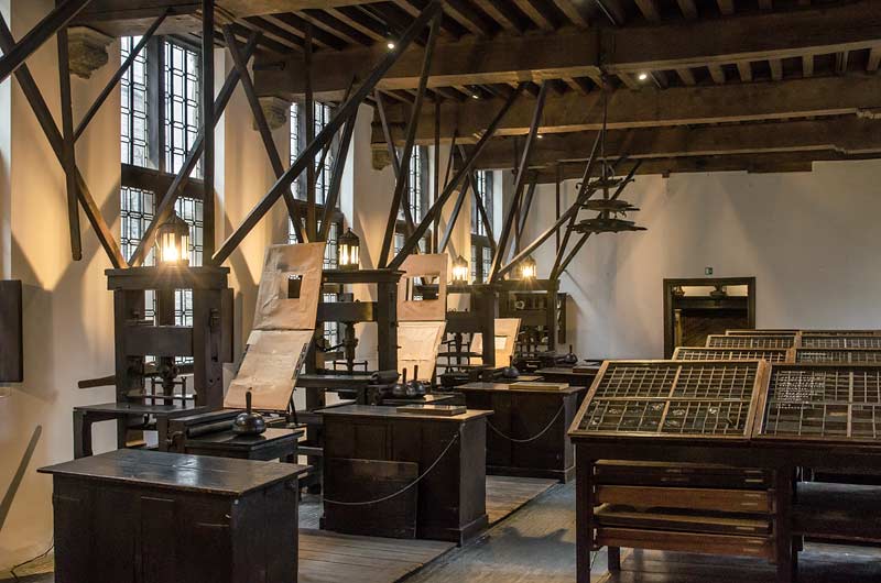
Visiting the museum of lithography
I finally managed to visit the ‘Steendrukmuseum’ in Valkenswaard, The Netherlands and snap some pictures of the stoneprinting presses and artwork. The ‘Brisset’ press below is the oldest one on display, built around 1880 in France.
Common PDF issues
Based on the results of a recent GWG survey the page about common PDF issues has been updated. Sadly the main issues that PDF users struggle with are largely the same from the old list created in 2008:
- Low-res images
- Incorrect color spaces
- Missing bleed
- Missing fonts
- Transparency issues
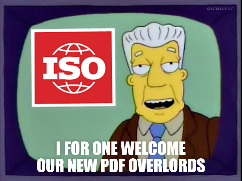
PDF 2.0 has been released
In 2007 Adobe handed over the PDF file format to ISO, the International Organization for Standardization. It took that organization ten years to come up with a new version of the PDF specifications. Earlier this month that finally happened when ISO released PDF 2.0. In the short run this will not have much impact but the new functions will gradually start being used by design and prepress applications. A short description of the new features and improvements can be found on the page about PDF versions.
Prepress Pete is tweeting
Friday flashback: In ’95 I was a trendsetter and sold the future of the US newspaper industry…. on Craigslist – https://www.prepressure.com/prepress/history/events-1995 …

Prepress Pete is tweeting
I also like their pop songs, not a Gorillaz fan though – https://www.prepressure.com/prepress/history/events-1992 … #TypefaceTuesday #fonts #typography
Prepress Pete is tweeting
Friday flashback: They both have air pumps but don’t confuse a 2017 Miele with a 1940 Miehle – prepressure.com/printing/histo… #printing #history
October
Prepress Pete is tweeting
Just admit it, you were waiting for this one to come around – prepressure.com/fonts/interest… #TypefaceTuesday #fonts #typography
Prepress Pete is tweeting
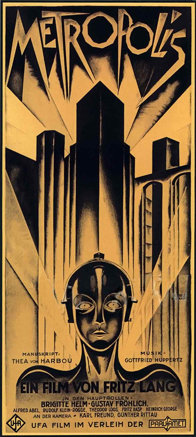
Friday flashback: ‘Metropolis’ showed a future in which a rich class rules and can afford very expensive posters – prepressure.com/prepress/histo…
Prepress Pete is tweeting
Difficult, coming up with something meta about Meta – prepressure.com/prepress/histo… #TypefaceTuesday #fonts #typography

Prepress Pete is tweeting
Friday flashback: The print is called ‘Young lovers with a clock’ but who watches the time when you’re in love? – prepressure.com/printing/histo…

Prepress Pete is tweeting
I bet women named Lucida are beautiful as well – prepressure.com/fonts/interest… #TypefaceTuesday #fonts

Prepress Pete is tweeting
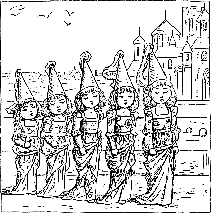
Friday flashback: the 130+ year fashion cycle – prepressure.com/printing/histo… #ColoringBook #history
Prepress Pete is tweeting
It’s fun, but not a circus – prepressure.com/prepress/histo… #TypefaceTuesday #fonts #typography
Prepress Pete is tweeting
Friday flashback: OMG, CMYKOG was such a PITA, YMMV but I’m glad it is AWOL, ROFLOL – prepressure.com/prepress/histo… #prepress #cmyk

Prepress Pete is tweeting
Google knows it when you stare at their typefaces – prepressure.com/prepress/histo… #TypefaceTuesday #fonts #typography #privacy
September
Prepress Pete is tweeting
Friday flashback: They should have called it the DesignWriter II, it still looks great – prepressure.com/prepress/histo… #Apple #History

Prepress Pete is tweeting
Friday flashback: With such a last name, how can you not end up founding a successful printing company? – https://www.prepressure.com/printing/history/1950-1999#1971 … #print
Prepress Pete is tweeting
All those Twitter bots must love this one – https://www.prepressure.com/fonts/interesting/ocra-and-ocrb … #TypefaceTuesday #fonts #typography #twitter

Prepress Pete is tweeting
Friday flashback: In the Twenties magazines started selling by the millions – https://www.prepressure.com/printing/history/1900-1949 … #History #Magazine #publishing
Prepress Pete is tweeting
The Indigo and DCP-1 were launched the same year and made a bigger impact, nuff said! – https://www.prepressure.com/prepress/history/events-1993 … #TypefaceTuesday #fonts

Prepress Pete is tweeting
Friday flashback: 10 years ahead of your time? Great! Maybe more than 1000 years ahead? Wow! – https://www.prepressure.com/printing/history/bc-1399 … #History #Printing
August
Prepress Pete is tweeting
This Helvetica precursor was created when cursors didn’t even exist yet – prepressure.com/fonts/interest… #TypefaceTuesday #fonts #typography

July
Prepress Pete is tweeting
Friday flashback: For travellers Baedeker guides were ‘the Google of its time’ – prepressure.com/printing/histo… #history #printing #publishing
June
Prepress Pete is tweeting
Friday flashback: Miniature Bibles were yesteryear’s way of tweeting the holy book – https://www.prepressure.com/printing/history/1700-1799#1727

The 70 Second Guide to Offset Printing
Two years ago I learned to use Blender, a 3D application. All the students had to make a short movie at the end of the year so I decided to create an animation that would be relevant for this site. It was fun but even though it took my computer ages to render all the frames I wasn’t completely happy with the end result. My movie is too grainy, too grayish and it features a somewhat quirky panning motion. It needs to be redone but this year’s project of learning JavaScript and jQuery kept me from doing so. Finally I decided to just put it on YouTube anyway and maybe update it later. Enjoy!
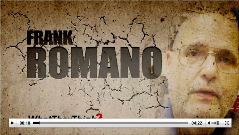
The bang and interrobang
In his weekly video Frank Romano talks about the bang and interrobang.
Prepress Pete is tweeting
Friday flashback: Shipping these new presses might take us ‘a nanosecond or two’ – https://www.prepressure.com/prepress/history/events-2012
New poll: what type of files do you receive?
While awaiting the results of the GWG poll on PDF usage, I decided to reuse one of their questions, just to see if the feedback on this site would be substantially different. The poll asked visitors which types of files they either send to a printing company or received as printers.
Prepress Pete is tweeting
Friday flashback: Stop the presses! There is war! No… wait! Start the presses! – https://www.prepressure.com/printing/history/1900-1949#1942
May
Prepress Pete is tweeting
Friday flashback: the guy in the back is calling to ask if the machine can also be used to print stuff – https://www.prepressure.com/printing/history/1950-1999
Prepress Pete is tweeting
Friday flashback: Two birthdays in a row, 1987 really was a fruitful year – https://www.prepressure.com/prepress/history/events-1987 #prepress #history

Not bad for an industry that some consider ‘dead’
Every day 520 million newspapers are read worldwide.
Prepress Pete is tweeting
Friday flashback: I’m moving to San Seriffe to marry the daughter of Pierre Myriad – https://www.prepressure.com/prepress/history/events-1977

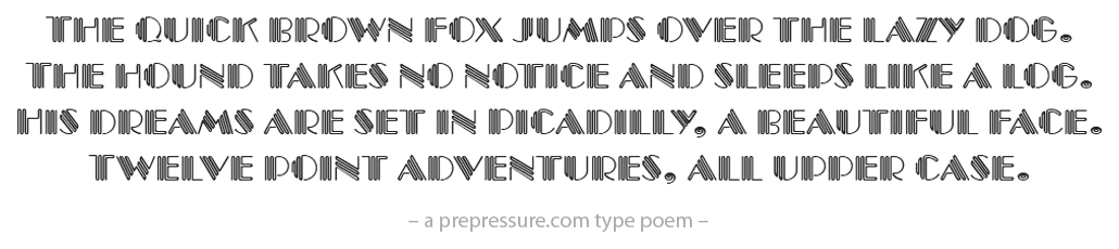
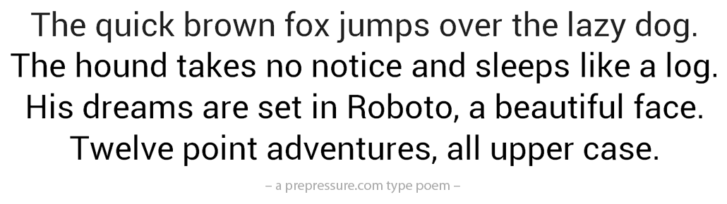
Font poems
I’ve started adding examples of typefaces to pages. First up are the pages on 1966, 1977, Arial and Caslon.
Prepress Pete is tweeting
Friday flashback: One day my boss had me trained on a Repromaster 2200 to learn ‘the old ways’ – https://www.prepressure.com/prepress/history/events-1983

April
Prepress Pete is tweeting
Friday flashback: In those days, men were men and presses were made of German metal – https://www.prepressure.com/prepress/history/events-1950-1959
Prepress Pete is tweeting
Friday flashback: David Pelham creates the iconic book cover for ‘A Clockwork Orange’ – https://www.prepressure.com/prepress/history/events-1972

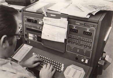
The phototypesetting era
I’ve lately gotten interested in phototypesetting – the typesetting systems from the 60’s, 70’s and early 80’s. Expect some more updates of the history of prepress pages about that era.
Illustrator and QuarkXpress turn 30
Earlier this month Adobe Illustrator turned 30. Boing Boing posted links to three videos about the history of Illustrator. It is funny that most of the comments on the article are from people who still have fond memories of FreeHand, its main competitor for so many years.
QuarkXpress also celebrates its 30th birthday. The above 1.0 splash screen is briefly visible on the anniversary page and I’ve also added it to the 1987 prepress history page.
Prepress Pete is tweeting
Friday flashback: Thou shalt commit adultery! – https://www.prepressure.com/printing/history/1600-1699

Prepress Pete is tweeting
Friday flashback: when it comes to #printing I do not mind stereotypes – https://www.prepressure.com/printing/history/1700-1799
Font versus typeface
The type snob is an informative article about typography. It focuses on web design but a lot of the recommendations apply to print design as well.

March
Prepress Pete is tweeting
Friday flashback: The Macintosh IIfx, the best computer I ever worked with. Period. – https://www.prepressure.com/prepress/history/events-1990

The poll: photo calendars
Each year my employer creates a beautiful calendar, using a variety of inks, substrates and printing techniques. That limited edition is popular with customers but I wonder how many people still value printed calendars at home. That is why a new poll asked visitors if they have photo calendar at home.
The previous poll asked visitors which version of Acrobat they use.
Prepress Pete is tweeting
Friday flashback: Louis Braille publishes his alphabet for the blind in 1829 – https://www.prepressure.com/printing/history/1800-1849

Plantin-Moretus revisited
Last week I spent an afternoon taking pictures in the Plantin-Moretus museum.
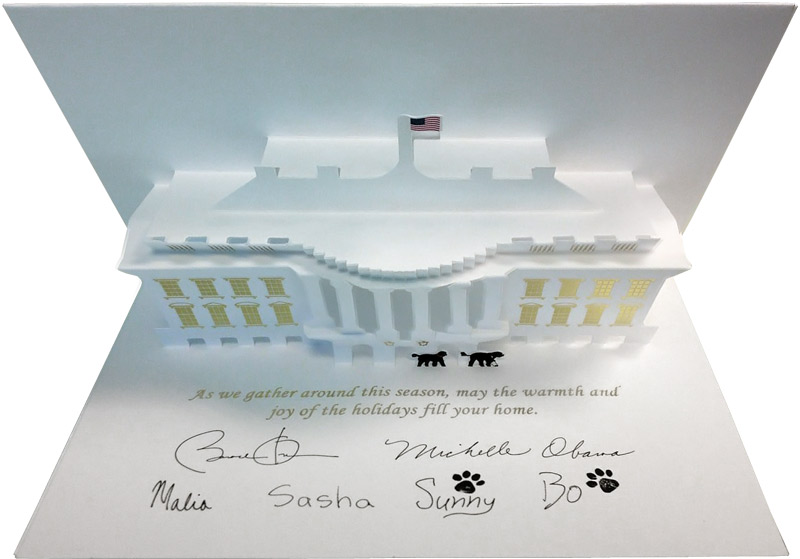
Get your cards here
It is kind of fascinating that US citizens can ask their president to sent them a greeting card because of an upcoming birthday, wedding, retirement or other special event. You just have to fill in a form on the White House website. Since that site is currently being reworked, the page is temporarily offline. What you cannot ask, though, is the Christmas card that US presidents since Calvin Coolidge in 1927 send to their staff and supporters. Below is the 2013 card of president Obama.
February 2017
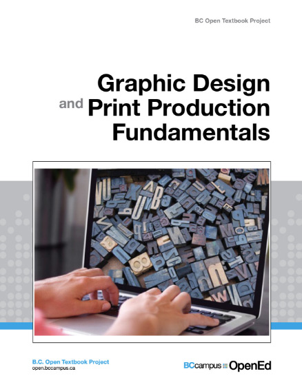
Graphic Design and Print Production Fundamentals
Who can resist a freebie? While working on a page about imposition I accidentally stumbled upon a free book about graphic design and print production. You can download the ebook version or read it online. It seems like a decent introduction but I haven’t read much yet, so you will have to find out yourself.
Prepress Pete is tweeting
Friday flashback: crude spot colors in funny penny prints – https://www.prepressure.com/printing/history/1800-1899
Prepress Pete is tweeting
Friday flashback: using Comic Sans in Photoshop 3.0 for the labels of my ZIP disks – https://www.prepressure.com/prepress/history/events-1994
PDF, what is it FOR?
Computerphile is one of my favorite YouTube channels, especially when printing and prepress related topics are covered. The video below has some nice PDF-related anecdotes in it but also discusses why the file format was developed in the first place.
Prepress Pete is tweeting
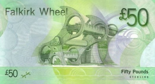
Friday flashback: Adobe kills FreeHand & the Scots get a fancy banknote – https://www.prepressure.com/prepress/history/events-2007
PDF 2.0
This summer the PDF 2.0 specifications will be released. For a standard that has been in the works for eight years, the list of new features that are relevant for prepress operators is fairly limited. A short overview can be found on the PDF versions page.
Keep in mind that specifications are just a starting point. It will take software vendors at least another year before applications , RIPs and workflows properly support the standard. Once the tools exist, users will have to go through a learning curve to make use of the new functions.
There are a few resources on the web that provide more information on PDF 2.0. I like the series of articles done by Martin Bailey on the Global Graphics blog. pdfLib published a highly technical 4-page overview. A few of the specs get discussed in this What-They-Think interview with Mark Lewiecki, Senior Product Manager at Adobe.

Emoji and print
You may find them ridiculous but since emoji characters are part of the Unicode standard, fonts increasingly support these icons. I was curious how many of the thousands of icons somehow relate to the printing industry. There is obviously a printer icon but also a nice range of print products. Stationery, newspapers, books, currency or maps: they are all there. Below you see the Apple version.
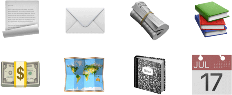
I also looked for icons that depict the trade. At first, I could not find any but then it hit me: they are hidden in plain sight! The committee that decides on these emojis did take our business serious and they provided emojis for both file delivery and prepress!

January 2017
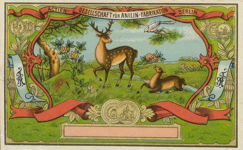
Old prints
I like old prints, such as photochroms, so it was a pleasant surprise to stumble across the card below. The ‘Actien Gesellschaft für Anilin-Fabrikation’ will celebrate its 150’th birthday next year. In case the name doesn’t ring a bell: you might know the company by its abbreviated name, Agfa.
Best wishes for the new year
Keep those presses busy! While they are at it, take your time to have a look at what happened in 2016.
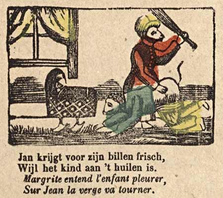
The combination of printing press and painting is quite wonderful.